


The aim of this blog post is to give you an idea of how to style in React Native. I mean everyone has its own method and there is no wrong and right. If you like how you style, then why would you change? For me, I had to go through multiple ways to find a comfortable method of styling.
I will show you three ways, how you can style a Card component in React Native.
First of all, lets start a new Expo project by using a TypeScript template. If you are not familiar with Expo, check it out!
expo init -t expo-template-blank-typescript
We will name our App expo-restyle-example. If you haven't used TypeScript, I highly recommend it. Autocompletion and type-checking is insane and it will detect your errors on the fly.
We jump into the directory by cd expo-restyle-example and if you are using Visual Studio Code, you can run code . in the terminal to open your project in VSCode. If you haven't enabled it yet, its time to do so (!) by following Launching from command line. We run the project via expo start. You will have multiple options how you want to preview your App (Android Emulator, iPhone Simulator or your own phone with the Expo Client App). Select one.
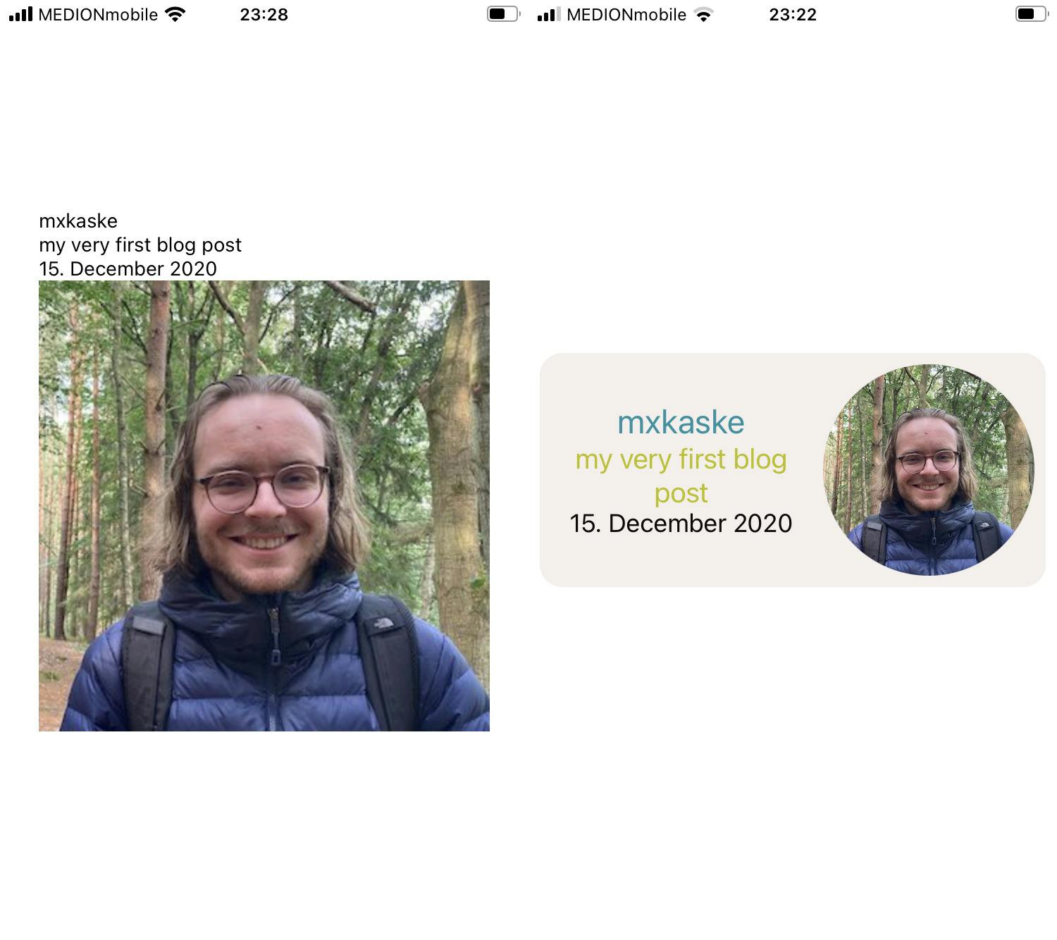
Alright, lets code! What we want to create is a small Card component that has a title, subtitle, date and a rounded image.
We will use the App.tsx screen to display our results. To structure our code, we create a src/components directory in which we put the Card/index.tsx component.
// src/components/Card/index.tsx
import React from "react";
import { View, Text, Image, ImageSourcePropType } from "react-native";

interface CardProps {
  title: string;
  subtitle: string;
  date: string;
  imgSrc: ImageSourcePropType;
}

const Card = ({ title, subtitle, imgSrc, date }: CardProps) => {
  return (
    <View>
      <View>
          <Text>{title}</Text>
        <Text>{subtitle}</Text>
        <Text>{date}</Text>
      </View>
      <Image source={imgSrc} />
    </View>
    )
};

export default Card;
Now we link the component to our App.tsx file.
// App.tsx
import { StatusBar } from "expo-status-bar";
import React from "react";
import { StyleSheet, Text, View } from "react-native";
import Card from "./src/components/Card";

export default function App() {
  return (
    <View style={styles.container}>
      <Card
        title={"mxkaske"}
        subtitle={"my very first blog post"}
        imgSrc={require("./assets/max-profile.jpg")}
      />
      <StatusBar style="auto" />
    </View>
  )
};
In fact, the component above is raw without any styles. Lets make it fancy. The first screen is our unstyled Card component. In the second screen, we added some basic styles you can use in React Native.
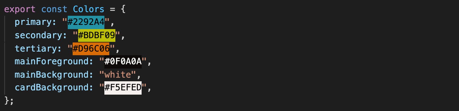
Before we start, let us define some Typography, Colors, Spacings in a separate file. That way, it will be easier in the future to change those styles and we stay consistent in the entire App. Because we have a restricted amount of variables, we combine them all into a single styles/index.ts file. If the App grows, it would be better to place each into a seperate Colors.ts, Spacings.tsand Typography.ts file.
// src/styles/index.ts
export const Colors = {
  primary: "#2292A4",
  secondary: "#BDBF09",
  tertiary: "#D96C06",
  mainForeground: "#0F0A0A",
  mainBackground: "white",
  cardBackground: "#F5EFED",
};

export const Spacings = {
  xs: 2,
  s: 4,
  m: 8,
  l: 16,
  xl: 24,
};

export const Typography = {
  body: {
    // fontFamily
    fontSize: 18,
    lineHeight: 20,
    color: Colors.mainForeground,
  },
  title: {
    // fontFamily
    fontSize: 24,
    lineHeight: 28,
    color: Colors.primary,
  },
  subtitle: {
    // fontFamily
    fontSize: 20,
    lineHeight: 24,
    color: Colors.secondary,
    },
};
I was using Coolors to get this color palette. A great tool for finding interesting color combinations that match perfectly.
One more usefull VS Code config for colors: Install the colorize plugin and add to your .vscode/settings.json following code snippet:
{
  "colorize.languages": [
    "javascriptreact",
    "javascript",
    "typescript",
    "typescriptreact"
  ],
  "colorize.colorized_colors": ["HEXA"],
}
This allows you to see the hex color as background color of the string. No more Fimga/XD color checking!
 Enough boilerplate done. Lets get to the styling. Therfore we have several possibilities which are listed below:
Possibility #1: Instyle CSS-in-JS
// src/component/Card/index.tsx
import React from "react";
import { View, Text, Image, ImageSourcePropType } from "react-native";
import { Typography, Colors, Spacings } from "../../styles";

interface CardProps {
  title: string;
  subtitle: string;
  date: string;
  imgSrc: ImageSourcePropType;
}

const Card = ({ title, subtitle, imgSrc, date }: CardProps) => {
  return (
    <View
      style={{
        flexDirection: "row",
        padding: Spacings.m,
        margin: Spacings.m,
        backgroundColor: Colors.cardBackground,
        borderRadius: Spacings.l,
      }}
    >
      <View
        style={{
          flex: 1,
          justifyContent: "center",
          alignItems: "center",
          paddingRight: Spacings.m,
        }}
      >
        <Text style={{ ...Typography.title, textAlign: "center" }}>
          {title}
        </Text>
        <Text
          style={{
            ...Typography.subtitle,
            textAlign: "center",
            paddingBottom: Spacings.l,
          }}
        >
          {subtitle}
        </Text>
        <Text style={{ ...Typography.body, textAlign: "center" }}>{date}</Text>
      </View>
      <Image
        source={imgSrc}
        style={{ width: 150, height: 150, borderRadius: 75 }}
      />
    </View>
  );
};

export default Card;
As you can see: caused by the amount of styling properties used, the Card component gets confusing to the eye.
Possibility #2: Extract styles into StyleSheet
Why not extract the styles and set them either below the file or into a seperate index.styles.ts files. Both have their pros and cons. If you set the styles below: you do not have to switch files for checking/updating the styles, but the one file will get larger and larger. On the other hand: If you don't have two monitors, changing between two files is a big minus as you often forget the applied stylings. So in order to work with two files you either need two monitors or a really good memory. I started my react native journey by using two files simply because the project that I took over was already in this structure. For simplicity, I will be showing how to extract the styles inside a single file. Therefore we use:
// src/components/Card/index.tsx
import React from "react";
import {
  View,
  Text,
  Image,
  ImageSourcePropType,
  StyleSheet,
} from "react-native";
import { Typography, Colors, Spacings } from "../../styles";
// import styles from "Card.styles"

interface CardProps {
  title: string;
  subtitle: string;
  date: string;
  imgSrc: ImageSourcePropType;
}

const Card = ({ title, subtitle, imgSrc, date }: CardProps) => {
  return (
    <View style={styles.card}>
      <View style={styles.textContainer}>
        <Text style={styles.title}>{title}</Text>
        <Text style={styles.subtitle}>{subtitle}</Text>
        <Text style={styles.date}>{date}</Text>
      </View>
      <Image
        source={imgSrc}
        style={styles.image}
      />
    </View>
  );
};

export default Card;


// Card.styles.tx
// export const styles
const styles = StyleSheet.create({
  card: {
    flexDirection: "row",
    padding: Spacings.m,
    margin: Spacings.m,
    backgroundColor: Colors.cardBackground,
    borderRadius: Spacings.l,
  },
  textContainer: {
    flex: 1,
    justifyContent: "center",
    alignItems: "center",
    paddingRight: Spacings.m,
  },
  title: {
    ...Typography.title,
    textAlign: "center",
  },
  subtitle: {
    ...Typography.subtitle,
    textAlign: "center",
    paddingBottom: Spacings.l,
  },
  date: { ...Typography.body, textAlign: "center" },
  image: { width: 150, height: 150, borderRadius: 75 },
});
Looking back at the Card component, there is no way to understand the UI without having the styles.
Possilbility #3: shopify/restyle
This will need some configuration and a little bit of code but believe me, you won't regret it.
First of all, let's install Restyle either with
yarn add @shopify/restyle or npm install @shopify/restyle.
Use what is familiar to you.
Restyle uses the React Context API under the hood. To access the whole Restyle ecosystem, you have to wrap your App inside a ThemeProvider which needs a theme.
We copy and paste most of the code from styles/index.ts into our new components/Theme.tsx component.
// src/components/Theme.tsx
import React, { ReactNode } from "react";
import {
  createBox,
  createText,
  createTheme,
  ThemeProvider as ReThemeProvider,
  useTheme as useReTheme,
} from "@shopify/restyle";

const theme = createTheme({
  colors: {
    primary: "#2292A4",
    secondary: "#BDBF09",
    tertiary: "#D96C06",
    mainForeground: "#0F0A0A",
    mainBackground: "white",
    cardBackground: "#F5EFED",
  },
  spacing: {
    xs: 2,
    s: 4,
    m: 8,
    l: 16,
    xl: 24,
  },
  textVariants: {
    title: {
      // fontFamily
      fontSize: 24,
      lineHeight: 28,
      color: "primary",
    },
    subtitle: {
      // fontFamily
      fontSize: 20,
      lineHeight: 24,
      color: "secondary",
    },
    body: {
      // fontFamily
      fontSize: 18,
      lineHeight: 20,
      color: "mainForeground",
    },
  },
  breakpoints: {
    phone: 0,
    tablet: 768,
  },
});

interface ThemeProviderProps {
  children: ReactNode;
}

export const ThemeProvider = ({ children }: ThemeProviderProps) => {
  return <ReThemeProvider theme={theme}>{children}</ReThemeProvider>;
};

export type Theme = typeof theme;
export const Box = createBox<Theme>();
export const Text = createText<Theme>();
export const useTheme = () => useReTheme<Theme>();

Text.defaultProps = {
  variant: "body",
};
Ok, this looks like a lot of code but as I said we basically copy and pasted the Spacings, Colors and Typography objects into the theme et voilà. Next to the ThemeProvider, we create a Box and a Text component with our newly create Theme type. Ah and we just set the default variant="body" for the Text component.
breakpoints are mandatory so we add some defaults. We add a typed useTheme hook, if we need the theme object outside of the Box and Textcomponents.
Don't forget to wrap your App content inside the ThemeProvider.
// App.tsx
import { StatusBar } from "expo-status-bar";
import React from "react";
import Card from "./src/components/Card";
import { Box, ThemeProvider } from "./src/components/Theme";

export default function App() {
  return (
    <ThemeProvider>
      <Box
        flex={1}
        backgroundColor="mainBackground"
        alignItems="center"
        justifyContent="center"
      >
        <Card
          title={"mxkaske"}
          subtitle={"my very first blog post"}
          date={"15. December 2020"}
          imgSrc={require("./assets/max-profile.jpg")}
        />
        <StatusBar style="auto" />
      </Box>
    </ThemeProvider>
  );
}
And as you see, we converted the View React Native component into a Box Restyle component using our predefined mainBackground color. You can access every style property (flex, backgroundColor, ...) using it directly as a property. As React Native's View and Text components do not have a lot of properties beside style, the components won't be overloaded by that change.
Now how will the Card component look like?
// src/components/Card/index.tsx
import React from "react";
import { Image, ImageSourcePropType } from "react-native";
import { Box, Text, useTheme } from "../Theme";

interface CardProps {
  title: string;
  subtitle: string;
  date: string;
  imgSrc: ImageSourcePropType;
}

const Card = ({ title, subtitle, imgSrc, date }: CardProps) => {
  const theme = useTheme();
  return (
    <Box
      flexDirection="row"
      padding="m"
      margin="m"
      backgroundColor="cardBackground"
      borderRadius={theme.spacing.l}
    >
      <Box
        flex={1}
        justifyContent="center"
        alignItems="center"
        paddingRight="m"
      >
        <Text variant="title" textAlign="center">
          {title}
        </Text>
        <Text variant="subtitle" textAlign="center">
          {subtitle}
        </Text>
        <Text textAlign="center">{date}</Text>
      </Box>
      <Image
        source={imgSrc}
        style={{ width: 150, height: 150, borderRadius: 75 }}
      />
    </Box>
  );
};

export default Card;
First of all, we reduced the file lines by 25% (from 59 to 25). Imaging doing that all along your components! Of course, we added the ThemeProvider but as your project grows, the more frequently you will write styling-boilerplate, and you will be happy to have Restyle. You will have noticed that I used the theme.spacing.l value to set the borderRadius. The spacing keys are exclusive to the margin and padding properties (as well as all side props as paddingVertical, paddingTop,...). But you could easily add type-safe borderRadius sizes using the borderRadii themeKey. This way we keep it simple, but we needed useTheme, which I use from time to time, to access the theme properties. This should be a good workaround.
What about the breakpoints we needed to add to the theme? Well every Restyle prop can be set depending on the screen size. If we want to keep a padding="m" on phone screens but increase it on tablet screens we could write : padding={{ phone: "m", tablet: "l" }}. I am using react-native-web and it can replace the css @media queries. Great!
The main reason why I use Restyle:
- Type-safe: written in TS and with the power of autocomplete it detects the error before it even exists.
- Write less code.
- Same properties as CSS-in-JS. Easy to remember.
- Adjust styles on the fly. No need to search for styles.
- Easy to read. (After not working on your components for quite some time, you will still recognize all the components and you will have a rough idea on how it will look like.)
- Dark mode is one toggle away: Create a new
darkThemeand inject it into theThemerProviderdepending on the user's settings (docs)
For more deep insides, check out @shopify/restyle.
Software Mansion has a great Webinar about Styling & Theming (introducing Restyle) with Haris Mamood, Senior React Native Engineer from Shopify.
The expo-restyle-example repository is on GitHub. Don't hesitate to clone and play with it.
Follow me on Twitter to get updated about my latest posts.
Cheers,
mxkaske